NChart3D Tutorial
Overview
This documentation provides a short tutorial that will explain the main concepts of the NChart3D framework as well as show you how to draw charts using NChart3D.
NChart3D is a versatile charting engine for macOS that lets you draw 2D and 3D interactive charts of different types according to your data.
The usage of NChart3D is very simple and requires only a few lines of code to visualize your data in a convenient and beautiful form.
Introduction
This tutorial will show you how to build a simple project using NChart3D that displays some random data, how to customize the appearance of charts and how to manage the selection of data. This tutorial is partially based on the samples provided on the NChart3D macOS DMG that can be downloaded here.
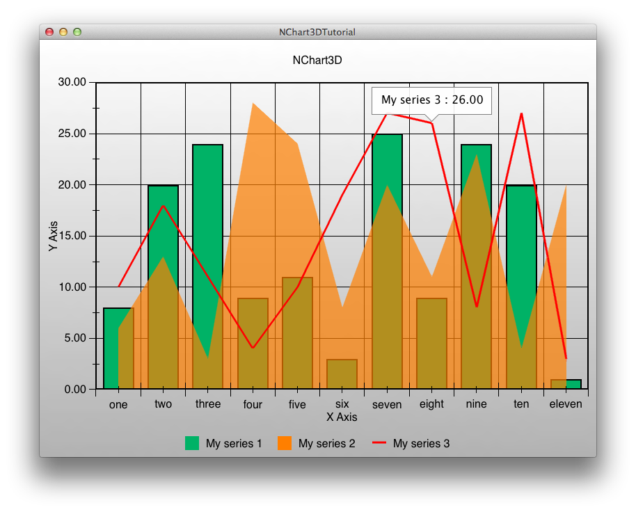
At the end of this tutorial you will be able to create a simple application that looks like this:
Xcode project
First, download the NChart3D macOS DMG. The framework is located in the "NChart3D.xcframework" directory and the set of samples is located in the "NChart3D/Swift-Samples" directory.
For each sample, the Xcode projects are already created, so you can check them out to see whether everything works properly.
This tutorial will show you how to create a project from scratch. Let’s begin!
Create a new project of the "macOS App" type with "Interface: Storyboard" and "Language: Swift".
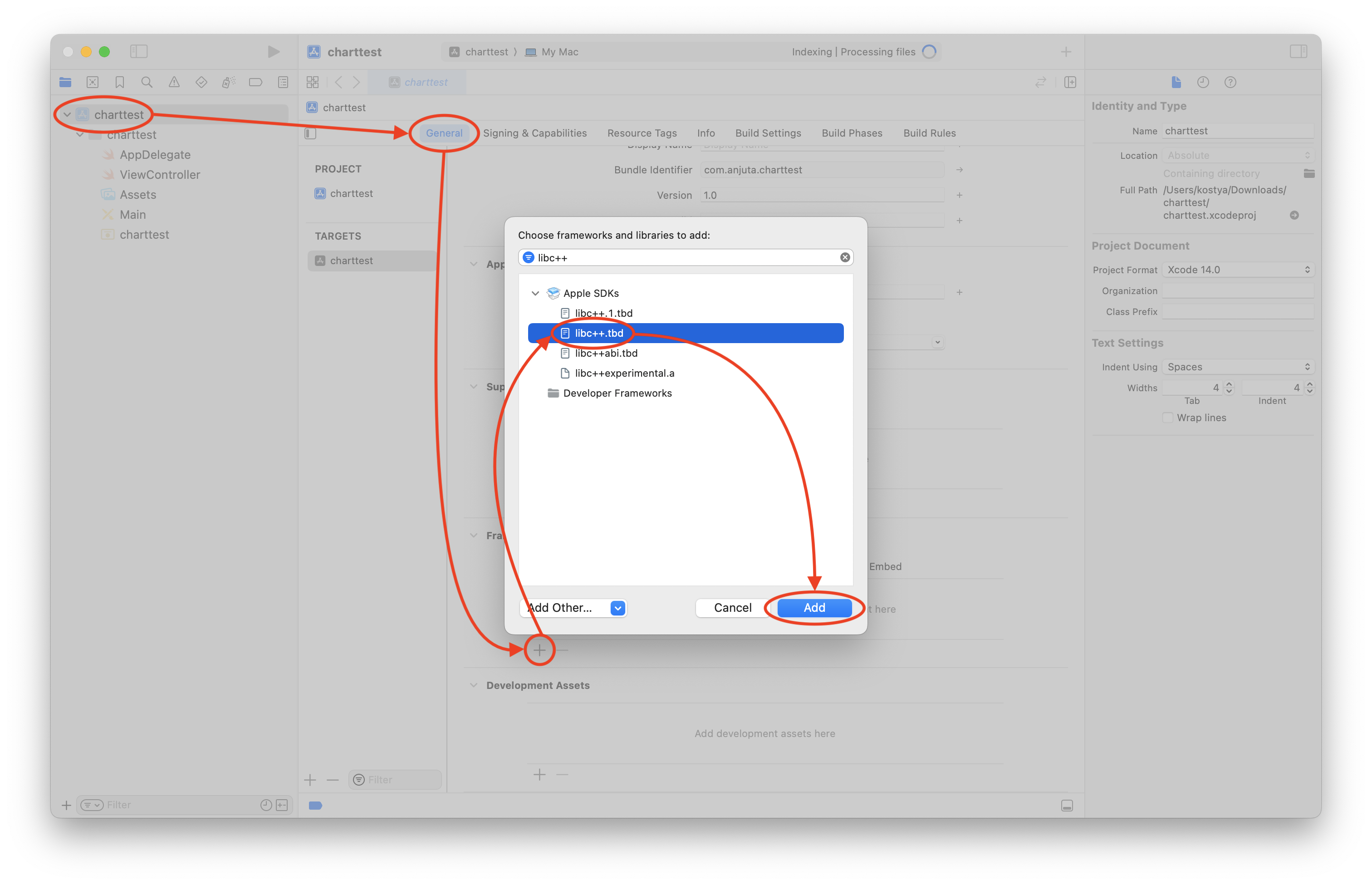
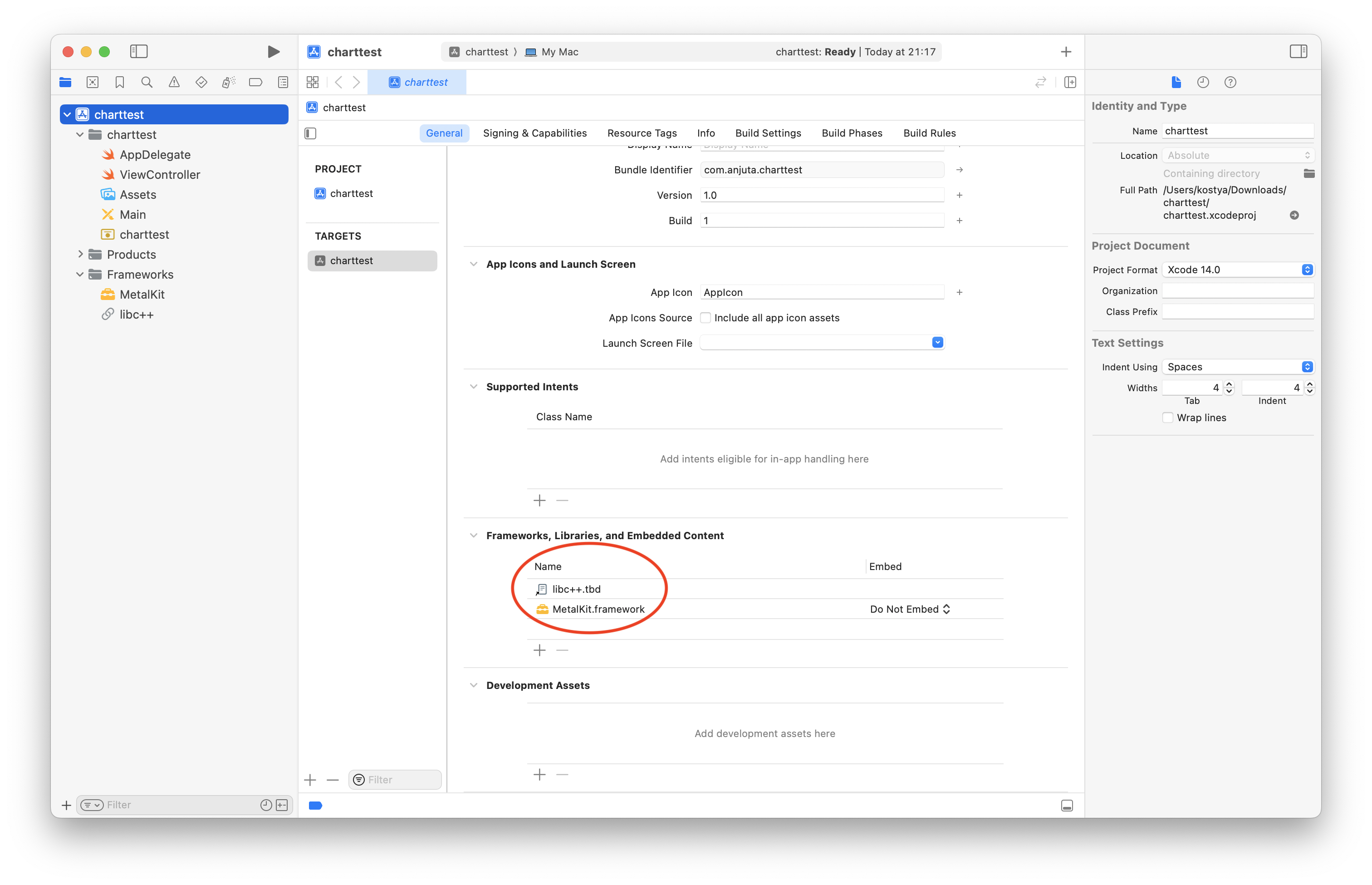
Add the libc++.tbd library and the MetalKit framework to your project:
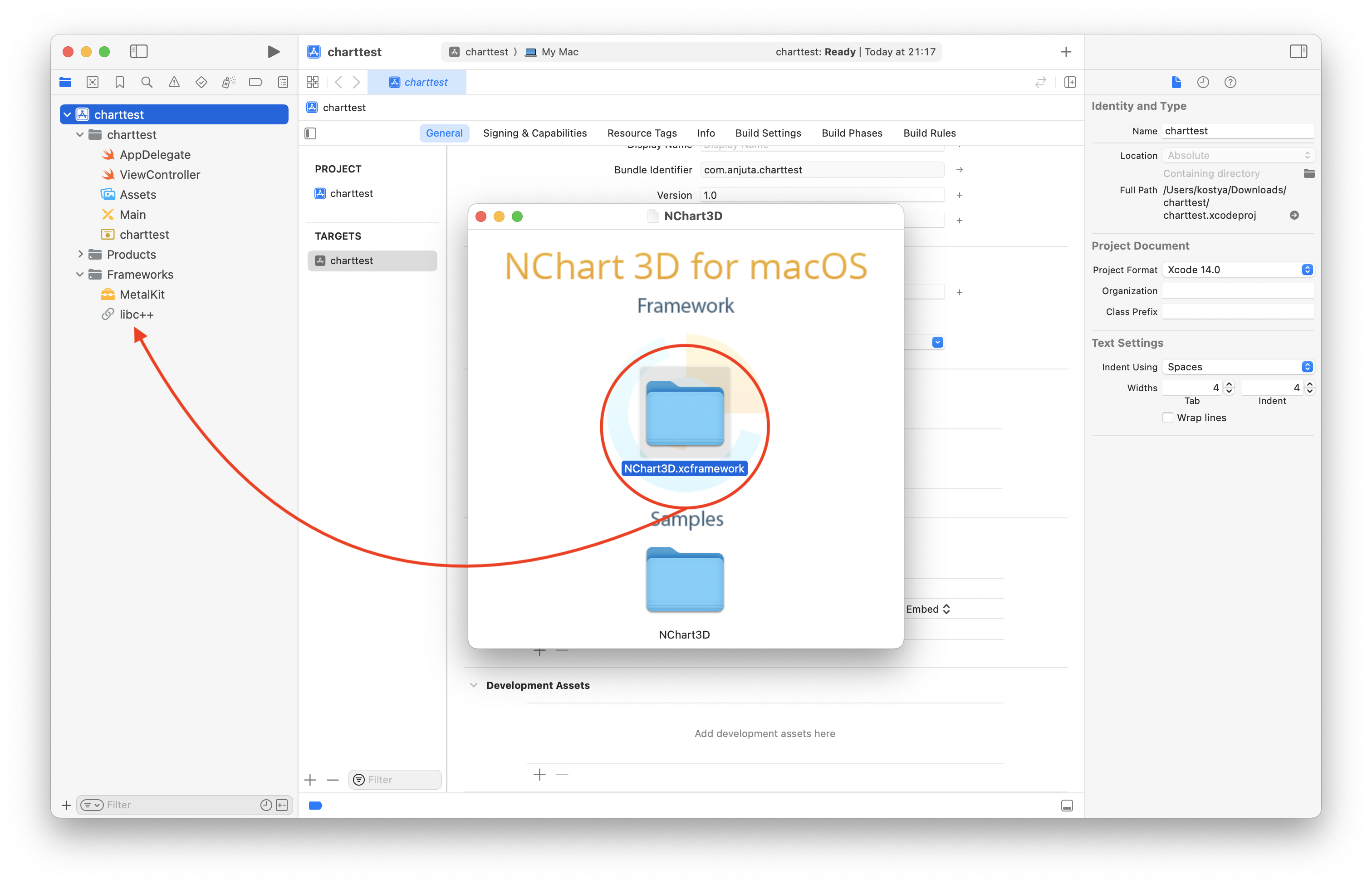
Drag the NChart3D.xcframework to the "Frameworks" group of the project:
Now your project is set up and you can start using the NChart3D framework!
Anatomy of Charts
Before we start, let’s explain a little bit of terminology.
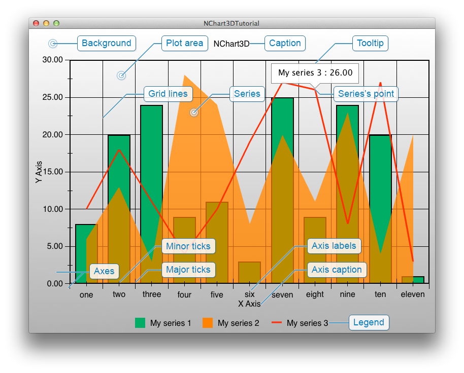
- Background — the color or gradient that fills the background.
- Caption — the text label (that can have background and border) that is displayed on top of the chart.
- Legend — the scrollable widget that contains the names and marker images of all the series on the chart.
- Plot area — the area where the series are drawn.
- Axes — axes that surrounds the plot area.
- Axes ticks — ticks that divide axes into pieces. There are major and minor ticks.
- Axes grid lines — lines on the plot area that are parallel to the axes and start in the major ticks.
- Axes labels — labels of the axes ticks.
- Axes captions — captions of the axes.
- Series — data visualizers.
- Series’ points — individual values in the series.
- Tooltip — a label on the chart displaying information about the chart point.
Drawing a Simple Chart
Let’s draw a simple chart. First, open ViewController.swift file and find ViewController class (or create, if this file does not exist).
Import the framework:
import NChart3DNSView that represents everything needed to display the chart in your views hierarchy. You can create an NChartView instance, place it anywhere you want and then communicate with the chart through the corresponding property of that instance.Add the internal field
m_view of the NChartView type to the ViewController, override the loadView method of ViewController and create there the new instance of the NChartView class like this:var m_view: NChartView!
override func loadView() {
m_view = NChartView(frame: NSRect(x: 0, y: 0, width: 480, height: 270))
self.view = m_view
}m_view.chart property.If you have a license key, set it to the chart like this:
m_view.chart.licenseKey = "Your license key"loadView method of ViewController.You may switch on anti-aliasing (that is off by default). It will not hurt performance, because the anti-aliasing algorithm is adaptive, so it is recommended to switch it on to get better visual quality of the image. Add the following line of code:
m_view.chart.shouldAntialias = truem_view.chart.adaptiveAntialiasing = falseNow you should create a series that will be displayed. First, create only one column series and assign some brush that will fill this series with color. For example, let this series be green:
let series = NChartColumnSeries()
series.brush = NChartSolidColorBrush(color: NSColor(red: 0.0, green: 0.7, blue: 0.4, alpha: 1.0))NSTableView the idea of a data source should be familiar to you. NChart3D framework uses the same concept of a data source for supplying data and delegates for reacting to user interactions.There is a protocol called NChartSeriesDataSource that you should implement to build a data source. For example, you can make a data source from
ViewController simply by adding the reference to the protocol in the ViewController.swift file as follows:class ViewController: NSViewController, NChartSeriesDataSourcefunc seriesDataSourcePoints(for series: NChartSeries!) -> [Any]! {
var result = [NChartPoint]()
for i in 0...10 {
result.append(NChartPoint(state: NChartPointState(alignedToXWithX: i, y: Double(arc4random() % 30 + 1)),
for: series))
}
return result
}
func seriesDataSourceName(for series: NChartSeries!) -> String! {
return "My series"
}rand() function. Feel free to experiment with different values and see what happens.The second method generates names for series to allow NChart3D to build the legend.
Now, when the data source is ready, assign it to the series you have created and finally add series to the chart:
series.dataSource = self
m_view.chart.addSeries(series)m_view.chart.updateData()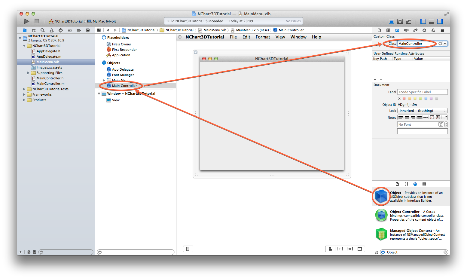
NSSupportsAutomaticGraphicsSwitching with the value YES to the Info.plist of your app. The discrete video card consumes more energy, but ensures high rendering performance.
Customizing Appearance
As you can see, the values on the axes are calculated automatically. Let’s customize them and display some labels on the X axis! The axes as well as the series can have their own data sources. These data sources can supply custom minimums / maximums or custom strings for labels of the ticks.
Add a reference to the protocol NChartValueAxisDataSource to the ViewController:
class ViewController: NSViewController, NChartSeriesDataSource, NChartValueAxisDataSourcefunc valueAxisDataSourceTicks(for axis: NChartValueAxis!) -> [Any]! {
if (axis.kind == NChartValueAxisKind.X) {
return ["one", "two", "three", "four", "five", "six", "seven", "eight", "nine", "ten", "eleven"]
}
return nil
}Let's also add captions to the axes. Implement the following method:
func valueAxisDataSourceName(for axis: NChartValueAxis!) -> String! {
    switch (axis.kind) {
    case .X:
        return "X Axis"

    case .Y:
        return "Y Axis"

    default:
        return nil
    }
}Of course, you should set the data source to the axes you want to customize. You can do this by adding the following line before your
updateData call:m_view.chart.cartesianSystem.xAxis.dataSource = self
m_view.chart.cartesianSystem.yAxis.dataSource = selfbackground property:m_view.chart.background = NChartLinearGradientBrush(from: NSColor(red: 0.7, green: 0.7, blue: 0.7, alpha: 1.0), to: NSColor.white)You can also add a border for your series, like this:
series.borderThickness = 2.0
series.borderBrush = NChartSolidColorBrush(color: NSColor.black)loadView method:m_view.chart.caption.margin = NChartMarginMake(0.0, 0.0, 0.0, 20.0)
m_view.chart.caption.text = "NChart3D"
Adding More Charts
Now let’s add more series to the chart.
Just create another series of different types, for example one area and one line. To do this, add the following code after the creation of the first series:
let series2 = NChartAreaSeries()
series2.brush = NChartSolidColorBrush(color: NSColor.orange)
series2.brush.opacity = 0.7
series2.dataSource = self
m_view.chart.addSeries(series2)

let series3 = NChartLineSeries()
series3.brush = NChartSolidColorBrush(color: NSColor.red)
series3.lineThickness = 3.0
series3.dataSource = self
m_view.chart.addSeries(series3)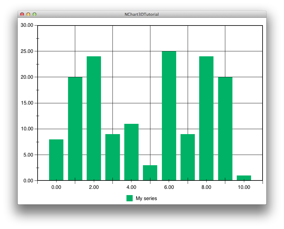
As you can see, three series of different types appear on the chart. Wait, what? The names in the legend are all the same! Let’s fix it. First, add the tag for each series like this:
series.tag = 1
series2.tag = 2
series3.tag = 3seriesDataSourceName method to the following:func seriesDataSourceName(for series: NChartSeries!) -> String! {
return "My series \(series.tag)"
}Adding Tooltips
It’s time to add tooltips that will appear and disappear by tapping chart points and display some information, for example, the name of a series and the current Y value.
To handle which chart points are selected when tapped, NChartDelegate is used. Add the reference to this protocol to ViewController:
class ViewController: NSViewController, NChartSeriesDataSource, NChartValueAxisDataSource, NChartDelegatefunc chartDelegatePointOfChart(chart: NChart!, selected point: NChartPoint!) {
m_prevSelectedPoint?.tooltip.setVisible(false, animated: 0.25)
if (point != nil) {
if (point.tooltip != nil) {
if (point == m_prevSelectedPoint) {
m_prevSelectedPoint = nil
} else {
m_prevSelectedPoint = point
updateTooltipText(point)
point.tooltip.setVisible(true, animated: 0.25)
}
} else {
m_prevSelectedPoint = point
point.tooltip = createTooltip()
updateTooltipText(point)
point.tooltip.setVisible(true, animated: 0.25)
}
} else {
m_prevSelectedPoint = nil
}
}To make this work, we should store the previously selected point somewhere. Let’s use internal optional variable called
m_prevSelectedPoint of type NChartPoint like this:
var m_prevSelectedPoint: NChartPoint?You may use some initial settings for the tooltip like this:
func createTooltip() -> NChartTooltip {
    let result = NChartTooltip()

    result.background = NChartSolidColorBrush(color: NSColor.white)
    result.background.opacity = 0.9
    result.padding = NChartMarginMake(10.0, 10.0, 10.0, 10.0)
    result.borderColor = NSColor(red: 0.5, green: 0.5, blue: 0.5, alpha: 1.0)
    result.borderThickness = 1.0
    result.font = NSFont.systemFont(ofSize: 16.0)
    result.visible = false

    return result
}func updateTooltipText(point: NChartPoint) {
point.tooltip.text = "\(point.series.name!) : \(point.currentState.doubleY)"
}Finally set the delegate for chart by adding the following line to the
loadView method:m_view.chart.delegate = selfWhat's next?
You can find more information about using the NChart3D framework in samples on the macOS DMG. If you have any questions, feel free to contact us.